Monday, February 28, 2011

Crit-Submit #1

-Dan dos Santos


Thanks to everyone who decided to take part in our first 'Crit-Submit'. We received close to a hundred submissions. I looked through all of them, and they varied greatly. Some of you are just starting out, whereas others of you are obviously at a professional level. I really enjoyed all of them regardless, and appreciate everyone's interest.


A few of the Muddy Colors guys were a little apprehensive about publicly criticizing someone's work, so I decided to do this round. It was also my big mouth that spouted out the idea in the first place, so I guess it only fair that I be the first to step up.


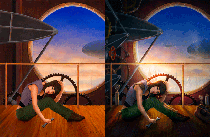
The piece selected belongs to Brady Allen.


A few things struck me as needing improvement right off the bat. Compositionally, the piece is quite empty. The figure does not seem well grounded, and overall, the image is a bit lacking in narrative. On the upside, all the makings of a really good piece are here. The face is beautifully rendered and the anatomy is spot on... so it really only needs a little tweaking.


Everything looks inadequate when it's next to this painting.
Firstly, let me clarify 'narrative'. By definition, the purpose of any illustration is to tell a story. In many cases that story is quite obvious, like a big fight going on or something. Other times, the story is a lot more subtle. Take this painting by Donato for instance. The 'narrative' is an internal one. Despite all the super cool stuff in the background, the real story takes place in the woman's mind. We immediately focus on her, and put ourselves in her position. Temporarily experiencing a slice of her life, we wonder 'What is going on in her head?' But in order for a picture to do this effectively, it needs to entice the viewer into her world. We need cues that help us feel like we know what her world is like. That is the purpose of her environment.


In Brady's painting above, we assume she is a mechanic simply because she is holding a wrench. But that doesn't really tell us much. I want to know... Is this her daily job? Did her work day just start, or was it a long exhausting day? Is this gear something that requires constant maintenance and perhaps troubles her regularly? Is that blimp in the background part of her fleet? These are the things that help a viewer believe in the fantasy, and they are where your -true- narrative lies.


The first thing I did when painting over Brady's piece was drop a shadow in the corners over everything I felt wasn't important. The top-left of the painting is attracting a lot of attention, and it doesn't need to. By darkening up these areas, we keep the focus on the character, and we also add more mood to the piece. I also dodged the sky behind her head for these same reasons.


From the start, the gear directly behind the girl's head was the focus of the piece. It had the highest contrast and sharpest edges. Reestablishing the values in the previous step helped this somewhat, but not entirely. So I decided to blow-out the gear a bit, and add some of that newly established light source on her body as well. I also added a shadow near her hand so that it seemed better grounded.


Once I reached this stage, I could really start to see what the piece needed. Mostly, it just needed 'stuff'. There is too little to look at, so nothing really holds the viewer's attention very long. Those big cogs are large, uninterrupted shapes, and so they command a lot of attention. By adding a LOT more overlapping gears we can add some additional interest and break up those big shapes, thereby making her face and the window the only real resting spots for our eyes. It also presents the opportunity to have some of these new gears point to the character's face, further drawing our attention to her, and helping balance out those other angles.


Everything else was added for the sake of narrative. If she is a mechanic, make her dirty... put some gloves in her back pocket... make her vest look a little more industrial... give her a tool bag. Help us experience her life. Also, if you're going to have a great big window there, you might as well put something interesting outside of it. By adding a few buildings and a lot more blimps, you now indicate a whole society. The viewer can better fill in the blanks about what her world is really like.


Normally, I would have added some decorative elements to the window, but that large empty space is an Art Director's wet dream. It is the perfect solution for type placement, so I decided to leave it as is. Aside from that, a little tweaking of the color (which I felt was too warm in the shadows), and that's about it!


Photobucket


Thanks for being our first guinea pig, Brady! I hope you find it more helpful than discouraging. The same goes for the rest of you. If you enjoyed the post, let us know, and we'll try to do it again. If there is something in particular that you'd like to know that I didn't discuss, just ask.
RC

Pegasus Coloring Pages


Posted in Pegasus Coloring Pages
Unknown Pegasus

Shaun Tan wins Oscar !


By John Jude Palencar


A big congrats to fellow illustrator (now also director) Shaun Tan.
Shaun won for the "Best Animated Short" based on his bestselling children's book "The Lost Thing". Donato Giancola, Greg Manchess, Irene Gallo and myself had the pleasure to have dinner a few years ago with Shaun. Those who know Shaun, know how unassuming and humble he is. I can't think of a better artist/ illustrator more deserving than Shaun.


Links Here and Here


View the film Here.
RC
Sunday, February 27, 2011

LTD

by Arnie Fenner


Since Mr. Giancola hasn't mentioned it yet, I'll take the opportunity to. Last year Underwood Books released Middle-Earth: Visions of a Modern Myth, a collection of the gorgeous paintings and drawings that Donato has been creating (some as commissions, but many on his on time and dime) for a number of years. Not only has he been scrupulously faithful to Tolkien's descriptions in his works, not only does Donato share his reasons and methodology for the scenes he's chosen to illustrate, not only do John Howe and Ted Nasmith pitch in to comment on the art, but, let's face it, $25 for a full color hardcover is a bargain-and-a-half these days, particularly for one this attractive.


But if you're a hardcore book collector, someone who prizes limited editions and who wants something unique, I thought I'd point out that there is a 26-copy leather-bound edition of Middle-Earth available. It's naturally signed by Donato and comes enclosed in a particularly lush laser-etched wooden box; as if the limitation isn't enough to make it desirable, Donato has taken it a giant step beyond by doing an original watercolor pencil drawing on special tipped-in paper in each copy (shown here are some of the drawings he's already done for the books). 26 copies, 26 totally different originals: limited editions don't get get much more unique than one-of-a-kind. Having been lucky enough to see many of Donato's original drawings, I know I want one. Which means now that there are only 25 available to collectors...or is that 24? Or 23...?

(Priced at $500 @, interested collectors should contact Donato via his website to find out how to reserve their copy.)


RC
Friday, February 25, 2011

Happy 25th Birthday, Link!

This week marked the 25th anniversary of the release of The Legend of Zelda. I'm guessing a ton of you have already seen this image, but if not, here is a pretty spectacular piece that a young artist know simply as 'Ag+' created in commemoration of the event.


Two lessons should be taken from this piece:

1. Never underestimate the power of the internet to make you famous overnight.

2. If you're going to spend a year making a piece this ambitious, please take the extra 10 seconds needed to sign your work!


And here is a video showing Ag+'s process (Thanks Eric!)


RC

Update: Terryl Whitlatch

***I just discovered that Terryl has several FREE VIDEO TUTORIALS on the Academy of Art University's website!***

http://online.academyart.edu/resources/creature-design-demonstrations/


Also, here is some additional info on the signings/demos I mentioned in Thursday's post:


RC

Inspiration: ODANI MOTOHIKO

Born in Kyoto in 1972, Odani Motohiko studied sculpture at Tokyo University of the Arts and Music.  Since graduating, he's had at least 7 major exhibitions to his name, most recently 'Phantom Limb', which is currently on display at the Mori Art Museum in Japan. The exhibition, which has been up since late November will be coming down this weekend. The exhibition is already scheduled to travel to two more museums, though as far as I know there are no plans for it to leave Japan as of yet.


The sculptures seen below are all part of the current exhibition. Despite my research, I have absolutely no idea how some of these have been created, as their medium is simply listed as "mixed media".


RC
Wednesday, February 23, 2011

Interview: Terryl Whitlatch

-By Dan dos Santos


Terryl Whitlatch was born in Oakland, California, and started drawing at less than three years of age. Blessed with a mother who was, and still is, a talented artist-illustrator, and a father who taught biology, her fascination with animals started early. Countless weekends were spent visiting zoos, aquariums, and museums, and her father was constantly bringing home mounted skeletons, creatures preserved in jars, and living animals as well - chicken hatchlings, bullfrogs, iguanas, and insects.


After studying illustration at the California College of Arts and the Academy of Art University, Terryl began a career that has spanned over 25 years. She has worked with many major studios and effects houses as a highly sought after creature and concept designer. Clients include Industrial Light and Magic, Lucas Film Ltd., Pixar, Walt Disney Feature Animation, PDI, Entertainment Arts, LucasArts, Chronicle Books, and various zoos and natural history museums.


She also teaches courses in animal anatomy and creature design at the Academy of Art University in San Francisco, and is the creator and illustrator of three books, The Wildlife of Star Wars: A Field Guide , The Katurran Odyssey, and the newly released Animals Real and Imagined.


I am a BIG fan of Terryl Whitlatch's work, and as many of you know, a certifiable art book junkie. So it should come as no surprise that I jumped for joy when I heard that Terry had a new book out called, Animals: Real and Imagined.  The book far exceeded my expectations. It is over a 150 pages, beautifully printed, and is jam-friggin-packed with art from cover to cover. It literally took me about 2 hours to go through it all on my first sitting. When I was done, I felt that jittery combination of simultaneous discouragement and inspiration that only really great art can instill in you. I think it's safe to say that the combination of Terryl's creativity and her comprehensive knowledge of animal anatomy is unparalleled in this industry.


Originally I had planned to do a simple post showcasing Terry's work and touting the brilliance of the book (which I strongly encourage ALL of you to check out), but instead, I decided to step it up a notch and try to get Terry herself to answer a few questions for us. Luckily, she was kind enough to oblige me.


Dan: Seeing as 'The Katurran Odyssey' was a collaboration with writer David Weiger, and your 'Wildlife of Star Wars' was all commissioned work now owned by Lucas, I believe this is your first book that you can truly call all your own. Congratulations. Do you feel that personal freedom has shown itself in any way in your newest book? 


Terryl: With every book that I have worked on, it’s always a team effort. That includes not only the author and illustrator, but the publisher, editor, designer, the list goes on. With this most recent book, my associate Gilbert Banducci wrangled in over 3 decades of artwork, categorized it, organized it, and acted as art director. While he respected my opinions, he oversaw the layout and design of the book, and his hard work kept it on schedule. I owe a great deal to him.


Dan: Many professional artists dream of the day they will be able to work on a personal project of this scale, but rarely find the time to do so. How did you manage to accrue such a large body of work during your personal time? Was this a project in the works for a long time, or did you take time off of work to specifically work on this? Any tips for others wishing to do the same?


Terryl: For others wishing to do likewise, if you are a busy artist, and working with deadlines, you really need to have help to do a book like this, whether it be friends, a spouse, etc. I was really blessed in that Gil is a professional art director and producer, as well as being a good friend.


Dan: Please tell us a little bit about your process. It is obvious that you are drawing your work traditionally, but it is difficult to discern your coloring process at times? Is this traditional as well, digital, or a combination of the two?


Terryl: I have worked both traditionally and digitally, depending up on the project. I do indeed draw traditionally, with pencil and paper, and then scan it if working digitally. However, I have been doing mainly traditional work over the last 5 years, as there is something very visceral and dimensional about tangible artwork, in that it exists in real space, and will not “go away” or get lost if the computer crashes. I’ve never missed a deadline. I’ve been exploring high tech markers such as Copics very intensely, the effect they give can look very digital, or traditional, depending on how one handles them—they are exciting, fast, and addicting to work with, they are so hands on and gorgeous!


Dan: Working in the field of concept art, which seems to be primarily dominated by digital artists, have you felt any pressure (due to deadlines or otherwise) to go entirely digital as well? If so, what is your reasoning for not doing so?


Terryl: No, I have not felt pressured to go digital as I’ve had no problems making deadlines. Quite the contrary—the response to the marker work has been extraordinary, and also keeps one’s work from looking like all the other digital stuff out there. Traditional knowledge and practice also in turn makes one a better digital artist as well.


Dan:  You have a LOT of impressive film credits to your name.
Is there a particular project you enjoyed working on most, and why?


Terryl: Gosh, that’s a hard question. All of the productions were unique and special. Star Wars, of course, was an tremendous and exciting ride, and I loved every minute of it. Brother Bear was also fun, but in a different way, more quiet and intimate.


Dan:  Being a concept artist, part of your job means working as a team. Sculptors and 3D modelers need to work from your drawings. Do you have any knowledge of these other techniques, and does that inform/restrict your work in any way?


Terryl: Yes, I have a basic working knowledge of these techniques, and while it is helpful, it is not absolutely necessary. The main thing is to be able to draw well and accurately, and also access the situation concisely, and give the artists what they are asking for.


Dan: What is your favorite drawing in the whole book and why?


Terryl: Well…if I could only choose one or two, I would choose the painting “Nebula”, and the developmental stages leading up to the Marine Mare. But then, I’ll always be biased towards horses! I also like the color acrylic sketch of the little squirrel monkey perched on a branch.


Dan:  Anything else you would like to add?


Terryl: It was really neat seeing this book come together. Sometimes, it was hard, as all artists see things they would like to redraw or “fix”. I’m no exception.


Thank you Terryl for taking the time to speak with us! 


******************************************************************


Terryl currently has three books out from various publishers, as well as 4 instructional DVDs from Gnomon Workshop. To purchase her newest book, Animals Real and Imagined, please click HERETo learn more about her instructional DVDs, click HERE.


Terryl will be doing book signings and demos at the Gnomon Workshop, Art Center College of Design in Pasadena, Ca., and Stuart Ng Books (aka: art-geek heaven), on March 17th, 18th and 19th, respectively. More info HERE.


RC

Working As An Art Judge

Gregory Manchess


It’s almost time to fly to Kansas to help judge the next Spectrum Annual. None of it would happen without the vision and grand efforts of Cathy and Arnie Fenner. Great effort is expected from all of us: time, money, energy. It’s exciting because as a group, we get to help highlight other lovers of fantastic art out there. 
Yet there’s another reason. For me, it’s an honor. I take great pride in being a part of the process. As with any artist’s career, it’s takes years to build the skills necessary for this job. I respect this role by giving it my full attention.
As a judge, it takes considerate effort to scan and absorb thousands of images and give them all as much attention as possible, however, there are many artists who consider it a day off from work, to just ‘flip through pictures.’ Apparently, they think that they can scan images quickly enough to judge pieces on-the-fly, without so much as a second glance because, as some have told me, they ‘knew what they were looking for.’
If an artist goes into a judging situation having already decided what it is they want to see, and what they are going to approve, why would anyone trust their opinion, much less invite them to return?
Judging is hard work. What makes it so is exactly what’s difficult about judging your own work: keeping a fresh eye. One has to allow the mind to be refreshed, to lose it’s prejudice, in order to detect with objectivity what makes a piece stand out. As artists, we recognize this endeavor and know how hard it is to stay objective. This effort, stretched across so many entries, is exhausting for the mind.
It takes preparation, like an athlete: good sleep, proper food, clear undistracted thinking. Multitasking is the bane of good judgement. (There is much research on this topic of late.) Recently, I’ve watched judges texting, emailing, and taking calls while judging.
Here’s my commitment to all who entered:
I’ll get rest and stay focused.
I won’t text.
I won’t check email.
I won’t conduct freelance business, or call the office.
I’ll stay as unbiased as possible: not just vote for the type of work I do, or want to see.
I will be fair to all styles and attitudes.
I’ll remember my early days and what I wanted to achieve.
I’ll remember to be open and try to understand what an artist is saying, revealing, expressing.
I’ll remember the difference between influence and outright image theft.
I know most of the judges this year. They are very skilled and generous with their votes. We’ll be at the top of our game when we’re there. I hope you entered. I want to see what excited you about work last year.


I wish you (and me!) all the best.
RC
Tuesday, February 22, 2011

New Painting Demo


What is the word of the day? Progress(be it slow and arduous) Here's a close up of what I've been working on. I'm also showing you the ref of the hand I'm using. Thank you all my friend/models. Again, I'm a big photo ref/ref in general advocate. At least until you've gained a better understanding of anatomy, light, form color etc where you can start to manipulate it more successfully. Something I constantly try to improve on.

And I also have a new video of here with a close up and explanation of my process and technique. If something is not clear feel free to ask questions. And for a small fee I'll answer them;) I jest.
RC

Illustration Process: Traditional Work

-By Justin Gerard

For this post and the next I will take a break from shameless self-promotions to share some process work.

Over the years, my process has mutated from the clear and straightforward approach of my early childhood:

Step 1: Tear page from coloring book.
Step 2: Turn page over and apply crayon directly to back of paper.

..And turned into an overly-complex and technically absurd mess that it involves hundreds of extra steps and expensive, new-fangled products.

So, I will break this into 2 parts to keep things more manageable.

Today's post is the traditional side, the place where I begin most of my work, and my next post will focus on the digital side, the place where I end most of my work.


Thumbnail
Ink on napkin

The conceptual stages are generally just exploring ideas to help find a compositional arrangement that seems pleasing. The tools used for this change from image to image. For concept-work I go with whatever works.


Rough Drawing
#7 pencil on copy paper


Once I establish a rough drawing that I like I do studies of most of the faces and figures. I will try to really nail the expressions that I am after. I always consider this one of the most important elements of the image. As Rockwell pointed out, "if you get the face and hands right, they'll forgive you for the rest." So if I have a face in the image, I try to make sure I have it established in a study somewhere.
And if it hasn't already been determined, these studies will help me to decide which lighting arrangement will be the most advantageous for the characters.


Study
General's HB Pencil on Strathmore Vellum


Tight Drawing
Pencil on Strathmore Bristol


For the watercolor stage I stick very close a process laid out by Peter De Seve in his excellent Step-by-Step Graphics article (Vol.10, no. 6) about his technique. (I highly recommend it if you can find it.)

De Seve's overall method in the article carries a great emphasis on preserving the drawing, which is one of the most alluring aspects of it for me. You can see from his work how well it allows him to play up his characters expressions and designs.

I will sometimes (and this is one of those times) apply workable fixative to the drawing before starting the watercolor. Fixative will leave the surface a little less workable for the watercolor, (the surface tends to be less absorbent) but will keep the drawing much more intact. Since I weep bitter tears to see the drawing slowly disintegrate, I am generally willing to risk it.


Watercolor over Pencil

The watercolor process begins with washes of earth colors to tone the paper, applied wet into wet. Then after this has dried color and value are slowly worked up with about ten thousand tiny washes applied wet into wet or wet into damp.

One of the nice things about this approach is that it allows folks like me, who have a foggy command of color at best, to experiment a lot as they work. If a color doesn't look right it is really easy to adjust.

After this I panic and then throw all the old illustrator tricks at the piece in a last desperate effort to save it.
These tricks include, but are not necessarily limited to: Ink, pencil, acrylic, markers, badgers, lawsuits, incantations, harsh language, oaths, gouache, threats and even blows.

Final Traditional Painting

Next Post: Digital Trickery
Monday, February 21, 2011

Endurance

-By Dan dos Santos


Irene Gallo just posted my cover for the upcoming novel 'Endurance' over at Tor.com'Endurance' is the sequel to Jay Lake's 'Green'. If you are a member of Tor's site, you can get a nice hi-rez wallpaper of the image that shows a lot of detail. Otherwise, stay tuned here, as I'll post some details and progress pics of the piece in the next few days.


RC
Sunday, February 20, 2011

Suggestion Box


By John Jude Palencar


Over the past few months the members of Muddy Colors have posted a variety of topics and subjects.


Dan Dos Santos has instituted an online critique. I'd like to take additional suggestions to further creative dialogue and knowledge building for Muddy Colors. Perhaps there is a subject, question or topic that we have not covered. Something that you would like to see or something we have not touched upon ... a subject that could be explored more thoroughly etc...


As the Amish say "Hands to work, hearts to God".

Let's use our happy hands for some great suggestions.

We will try our best to address any suggestions that we feel are applicable.
RC
Saturday, February 19, 2011

Action Man Coloring Pages

Action Man Coloring Pages 001
The 2009 London edition is the one that is generating immense attention because Character Group, which is the licensed U.K. toy company for the vintage Action Man, decided to come up with a range of HM Armed Forces action figures.
Action Man Coloring Pages 002
The toy company worked closely with the Ministry of Defense, and the actions figures released were a phenomenal success, to say the least. Mortar Man is the figure with heavy ammunition, and dressed in desert gear
Posted in Action Man Coloring Pages 003
Unknown Action Man
Friday, February 18, 2011

This Weekend


by Arnie Fenner


If you live in the Boston area, why not go see Greg Manchess and Irene Gallo at Boskone this weekend? They'll be sitting on panels, Greg will do a painting demo, and I think there's even supposed to be a display of 30 or so Manchess originals; combine that with all the other convention activities and a good time is almost certainly guaranteed.


RC