Thursday, March 31, 2011

FAIL

by Eric Fortune

Firstly, because the previous post kicks arse. Secondly, and most of you have probably been through this, I'm in the process of pulling an all nighter( if you're a vampire like John Palencar it's called an "all dayer";). Hooray! I've been eating small meals throughout the day as well as a short power nap here and there for the long haul. If I eat too much the "itis" kicks in and I'm no good. It also helps to balance out the coffee intake I have set up in an IV. The IV is nice cause I don't have to waste time actually drinking. The diaper frees up....well, I'll leave that one alone.

I don't feel too horribly stressed out because I spent most of the time painting the important areas first, the figure. I'm at a stage now where I'm painting a lot of drapery and plan to try and loosen up a bit and enjoy the process. I'll most likely take it as far as I can within the next several hours and tweak it in photoshop. It's also printing quite small so the piece should tighten up nicely.

Here's a progress shot...yeah, defitely some photoshop.


RC

Eowyn and the Nazgul

Petar Meseldzija just posted a gorgeous new painting depicting Eowyn fighting a Nazgul, for which he had posted several progress sketches of a while back. Check out his awesome blog for more insight into his process as well as some detail shots.


It's a pretty epic scene from one of the greatest fantasy novels of all time, so it is no wonder that a lot of fantasy artists have painted their homages to it over the years. Here are a few great ones:


The Brothers Hildebrandt:


Donato Giancola:


John Howe:


Ted Nasmith:


W.M. Kaluta:


Matt Stewart:


Frank Frazetta:


Angus McBride:


RC
Wednesday, March 30, 2011

Spectrum Selections


The list of Artists who made it into Spectrum 18 is up!
Click HERE to see if you made it... Good luck!


And for posterity's sake, here is a jpg of the final list:


RC

Crit-Submit #2

-By Jesper Ejsing


Hey Everybody.


I have been chosen to do the next round of critique. I am glad, and frightened. First I would like to say the corrections or suggestions if you like, is only examples of what I would have done different, and not necessarily true or even better. But since I also tell why I would change these elements I hope you can gain something out of it.


Among the many pictures sent in, I chose this one by Anthony J. Schmidt. I like the image. It portrays a situation like most paintings I do and I feel most confident in criticising analogue painting. This one was done in watercolour.


First off. To me the most important thing in an illustration is telling a story, and telling it clearly. There should be no need for explanations and you should be able to “read” it right away. What I focus on when doing a scene like this is: clearly readable silhouettes, foucs via details and color intensity, and clearness in forms. That means getting rid of tangents.


Here is what I think Anthony’s painting needs to be a bit more easy to read:


The fighter kind of disappears into the background. He has basically the same colours as the background and the shapes in the cliff behind him makes him difficult to see. The head is the most important thing. It is immediately what draws the eye, so I came up with a simple solution: to make his head a clear silhouette I added another waterfall behind it. That way, painting over a part of the cliff giving the whole area behind his head and axe a less busy texture. Also it makes the head stand out as a dark patch on white background. Doesn’t get much clearer than that.


Added waterfall behind warrior's head.
Next is the area behind the giant. It is much too busy, compared to the fact that it is one of the least interesting parts of the painting. To me the faces of the 2 figures and the interaction between the 2 facial areas is the focal point, the rest is less important the longer you get from the focal point. When doing a painting like this I force myself to go less and less detailed by using bigger and bigger brushes the father away I get from the focus. This way I do not end up detailing leaves and stones in the corners. When I go closer to the faces I use smaller and smaller brushes thus adding a focus by shear grading of details.

Well, I needed the area to be more calm so I just copied the cliff behind the fighter and made it into a large stone, creating a calm and light area with out too much contrast. This way, we read the backside of the giant better. I also lighted the triangle between his legs to make them clear.


Simplified the area behind the giant's legs.
In the next stage I added some light to the shoulder part of the Giant. It felt wrong that the skin tones had so much light and that the leather jacket didn’t. Light does not just stop because the material changes. But it is a mistake very easy to make when painting traditionally. Because you change colour on the brush, and you probably didn’t even do the skin tones the same day as you did the costume. But it is extremely important to be consistent with the lighting. I greyed out the area behind the giant's braids to make his front more clear. Most important I needed the whole area of the legs of the fighter to be lighter to make his feet seem darker and thus more readable, so I painted in a lot of light brown and green to make the trunk light and simple.


Added consistent lighting to the giant's shoulder.
Next is the rim light. I use this trick all the time . it is a blessing and a curse. But since Anthony already had a bit of bluish rim light I felt I wasn’t stepping into unfamiliar territory. On the handles of the weapons on the giants back, the light really helps to pull the silhouette out from the background. The axe and especially the thigh and feet of the fighter benefits from the white light.


Added rim-lighting to both figures. 
Lastly, I think the colours are a bit too desaturated. I would have used stronger colours if it was me, but out of respect for the original painting I will only tweak the saturations a tad and only at the focal points. This way the eye is drawn yet again to the important place because it is also the place with the most intense colours.


Boosted the color saturation around the focal points.
I know that my changes are not dramatic or radical. Some of them are maybe even distasteful. But in any way they make the image a clearer image and the picture easier readable and thus the story more intense. I hope you can agree to the reasons why I changed stuff. It was all done in the name of clarity.


Also I have tried to convey the difficult choices you face in doing a scene in an illustration. Using the tricks of focus can be difficult and should only be used the important places or else the eye gets lost. I have added a piece I did a while back that had some of the same problems. But it shows how you could use focus to clear up a very busy image. The background for example have almost no trunks and no leaves at all, just messy broad strokes of blue and green. Yet you are not in doubt that it is a forest. Try imagining the same image with a full detailed forest behind where I had rendered every leave and bark structure in the trunks. Think of the eye as a camera that can only focus on one thing at a time. The simple background makes the detailed stuff seem more important. It is a matter of choosing your guns right. Same goes for the less important arms and especially the feet. I just made them flat and without much contrast. What I did instead was punching out the colours and the details on the faces and the ground right between the ape-demon and the last man standing. This area is the only part of the background that needs focus. One last thing: I used a very warm and heavy reddish colour for the Ape and a very light and cool colour for the background behind him to pull the 2 elements apart.


I hope you enjoyed this little paint over. I could talk on forever, but I need to fix a painting now that I am doing. It has lost all focus and is only a muddy patch of undefined brown. With all my own advice still clear in my head I might as well take a bold and dramatic choice.

-Jesper


A note from Dan:

I would also like to quickly chime in on this piece. I could not agree more with Jesper's assessment of the piece. To me, above all else, legibility is most important. Though, I think that this piece can be pushed even further by controlling the value structure a bit more.


By hazing out a few of the background elements, and darkening the shadows on the figure, we can better emphasize the silhouette. Most notably, I added a bit more white behind the warrior's back, and a few cast shadows on the giant.


Reduced contrast and lightened the background.

Heightened contrast and darkened the foreground.
All in all, this piece was already pretty great before we even got our hands on it. The changes Jesper and I are encouraging are subtle, but important. Paintings of this nature are often used for gaming art, meaning that they will likely be reproduced VERY small. Legibility takes on especially great importance at a small scale because a lot of subtlety gets lost in the reproduction. So much so, that one often needs to compensate by actually over doing it at times. Take a look at the Magic: The Gathering gallery found HERE, and look at how some pieces stand out right away. Take the time to try to discern why these paintings work better at such a small scale.


Below is an animated gif showing the three major stages of Anthony's painting:


Photobucket


Thanks again to all those that submitted this round. Your interest in greatly appreciated, and as usual, the submissions were all really wonderful to look at. Stay tuned, as we'll post info about the next Crit-Submit soon!
RC
Monday, March 28, 2011

We're all dead.

-By Dan dos Santos


It is the year 2291, and Dr. Scott Van Foschessantos has unearthed a trove of paintings long buried in the frozen ruins of Old New York. Having already carefully excavated the site and transported the findings to his lab, the Doctor is using state of the art technology to restore these artifacts to their former glory. As if peeling away time itself, each painting has been examined, layer by layer, in order to deduce the exact materials each artist implemented. A small sampling of his finding are listed below.


A member of Van Foschessantos' team inspects a painting on the vacuum table.


Artifact A-01:

Signed upper left: "Gregory Manchess"


Upper most layer: Final picture varnish

Painting: Oil paint, consisting of varying formulas, mostly Old Holland, slight amounts of Galkyd and Alkyd White detected.

Underpainting: Acrylic wash, a mixture of Ultramarine Blue & Burnt Umber

Preliminary drawing: 2B Graphite, applied directly to surface

Primer: 2 layers of Acrylic gesso

Substrate: Belgian linen


Artifact A-02:

Signed lower right: "Dan dos Santos"


Upper most layer: W&N Conser-Var
Intermediate varnish: W&N Artist's retouching varnish
Painting: Oil paint, consisting of varying formulas, mostly Rembrandt, slight amounts of linseed oil and cobalt drier detected.
Underpainting: Sepia Acryla-gouache.
Sealant: Krylon Workable Fixative
Preliminary drawing: 2B Graphite, applied directly to surface
Primer: 3 layers of Acrylic gesso
Substrate: Strathmore 500 series Illustration board


Artifact B-04:
Signed lower right: "Paolo Rivera"


Upper most layer: Gouache
Underpainting: Thinned Sepia gouache.
Preliminary drawing: 2B Graphite, applied directly to surface
Primer: none
Substrate: Strathmore 500 series Bristol board


Artifact B-06:
Signed lower left: "Sam Weber"


Upper most layer: Colored pencil and Gouache
Painting: Multiple layers, alternating between W&N watercolors, charcoal pencil, and Golden Glazing Medium (Satin finish)
Underpainting: Golden Fluid Acrylics
Preliminary drawing: 6B Graphite transfer, modified with 2H graphite drawing
Primer: none
Substrate: Fabriana 300 lbs hotpress watercolor paper


Artifact BC-08:


Signed lower right: "Boris Vallejo / Julie Bell"
Upper most layer: W&N Damar Varnish
Intermediate varnish: W&N Aerosol Retouch Varnish
Painting: Oil paint, consisting of varying formulas, mostly W&N, no siccatives detected.
Underpainting: Acrylic wash, a mixture of Burnt Sienna and Burnt Umber
Preliminary drawing: HB Graphite, applied directly to surface
Primer: 3 layers of Acrylic gesso
Substrate: Strathmore 500 series Illustration board


Artifact C-05:
Signed lower left: "Eric Fortune"


Upper most layer: Golden Polymer Varnish with UVLS (Satin finish)
Painting: Liquitex Acrylic
Preliminary drawing: HB, 2B drawing
Primer: none
Substrate: Strathmore hot-press watercolor paper, 300lb


Artifact C-06:
Signed lower right: "J. J. Palencar"


Upper most layer: Aerosol Varnish
Painting: Acrylic, varying formulas; traces of matte medium, gloss medium and nicotine detected.
Preliminary drawing: H, HB, 2B Graphite, applied directly to surface
Primer: none
Substrate: Arches hot-press watercolor paper, 300lb


Artifact C-11:
Signed lower right: "Dave Seeley"


Upper most layer: Liquin
Painting: Oil paint, slight amounts of Liquin Impasto Alkyd detected
Primer: 2 layers of Acrylic Gloss Medium
Preliminary drawing: mechanically integrated with substrate
Substrate: Epson Piezo Pro Matte Canvas, mounted to 3/16" masonite


Artifact D-02/03:
Signed lower right: "Bruce Jensen"
Upper most layer: Gamvar
Intermediate varnish: Galkyd
Painting: Oil paint, mostly Gamblin, slight amounts of galkyd/gamsol detected
Preliminary drawing: Graphite transfer applied directly to surface
Primer: Multiple coats of Acrylic Gesso
Substrate: Vellum, mounted to 3/8" Birch Plywood


Artifact D-06:
Signed lower left: "Lars Grant-West"


Upper most layer: Mixture consisting of 7 parts galkyd, 2 parts wax medium, 1 part Gamsol
Painting: Oil paint, trace amounts of galkyd detected
Underpainting: Oil paint and oil stick, raw umber
Preliminary drawing: Graphite drawing, applied directly to surface
Primer: 3 coats of Neutral PH PVA adhesive
Substrate: Stretched Linen


Artifact D-20:

Signed lower left: "Donato Giancola"


Upper most layer: Gam-Var
Intermediate varnish: Galkyd
Painting: Oil paint, slight amounts of Sun-thickened Linseed oil, Venice Turpentine and Damar Varnish detected
Underpainting: Acrylic wash
Primer: 3 layers of Acrylic Matte Medium
Preliminary drawing: mechanically integrated with substrate
Substrate: Strathmore 500 series cold-press paper, mounted to 1/4" masonite
RC

Robots!

by Arnie Fenner

Sometimes we forget that we (whomever culturally "we" may be) don't have a monopoly on ideas and art and goofy what-the-hell? fun. So it's nice to be reminded that people in other countries get wrapped up in creating art projects (much like we all have) that undoubtedly get the stink-eye from their neighbors and encouragement from their peers...like the big-ass robots posted on this Chinese SF fan site.


I haven't the slightest idea what they're talking about on the site, but definitely know that I'd like to drive the tank to work during rush hour.


And while I'm thinking about art that makes a BIG impact, I wish I could get Steve Kirk to re-do the exterior of my house the same way he did Harlan Ellison's (which Harlan happily refers to as "The Aztec Temple of Mars")...
RC
Friday, March 25, 2011

Captain Bob

-By Dan dos Santos


If any of you have seen me give a lecture, you've probably heard me mention a man named Robert Cottle, better known as 'Captain Bob'.


Bob Cottle was the host of a 50's puppet show called 'Ruff & Ready', which later spawned a spin-off show called "The Nature World of Capt. Bob". The show, which focused on how to draw things in nature, went off the air in the mid 60's. It was later re-aired in CT and MA until the 80's. Growing up in Connecticut, I was able to catch these amazing episodes every Saturday morning at 5:30 am. Since VCRs were not that common yet, I was diligent about never missing an episode, even if it meant skipping family vacations. I was obsessed.


Capt. Bob was my first introduction to instructional drawing. I always attempted to copy various drawings and cartoons that I liked, but I had never met anyone who could show me HOW to do it. His show really opened my eyes, and taught so well some of the fundamentals of basic drawing, such as starting with big shapes, and drawing lightly so you can later refine things. These are things we may take for granted now, but coming from an unartistic family, this was mind-blowing to me as a 6 year old! Still to date, I can think of very few influences who have had a greater impact on my artistic life than this man.


I have searched for years trying to find videos of this show, to no avail... until now! Apparently someone uploaded a single episode to Youtube a few months back, and man am I grateful! I recall watching this very episode as a child, and it is honestly every bit as wondrous as I remember it... if not better. Please watch the clips below, I promise you won't be disappointed. This man had an amazing ability to engage his audience and describe his methods. I am -very- passionate about teaching, and I can only hope to one day obtain a fraction of this man's charisma and brilliance.


When you watch the video, take note of the things he is doing for the audience's sake, such as sitting several feet to the left of his easel so you can see what he's doing. That must be uncomfortable, and make it really difficult to draw accurate proportions. Yet he makes it look effortless. He is also drawing completely from memory on live television... not something I would care to attempt.


RC
Thursday, March 24, 2011

Guest Blogger : TYLER JACOBSON

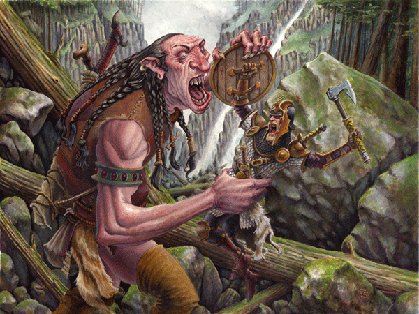
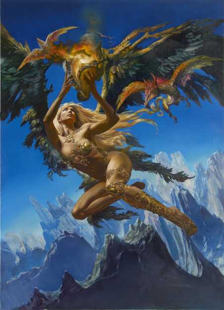
A short while back I had the pleasure of meeting Tyler Jacobson, who until that point, I had simply referred to as "That-new-guy-who's-work-I-keep-seeing-everywhere". In just a few short years, Tyler has managed to make the transition from a talented student with a lot of potential, to a well published illustrator, receiving this past year's Jack Gaughan Award for Best Emerging Artist. Since so much of our audience here on Muddy Colors consists of young, aspiring illustrators, I thought it would be beneficial to have Tyler give you a first hand look at how he broke into the business.


D&D and Me

-By Tyler Jacobson


First off, I want to thank Dan for inviting me to post on Muddy Colors.  I really enjoy following this blog.  I thought I would share a little of my experience illustrating for D&D.


A little over a year and half ago I was introduced to an art director named Jon Schindehette by Irene Gallo.  Irene had seen my work at the 2009 Spring Show for the Academy of Art University.  A few weeks later Jon looked me up and we started chatting. He offered me a few pieces for Dragon Magazine, an e-publication for Dungeons and Dragons.  Being my first big job out of school, I was all over it and attempted with all my power to assemble everything I had just learned over the past few years and apply it to actual professional work.  In my head I wasn't sure if I was up to task.


Not too long ago I was a kid....and a nerdy one at that...but hey, there's no shame it.  I loved sci fi and fantasy and was into a lot of the big games then.  D&D and Magic were certainly big sellers and high on the list of “please, please, please buy me this book” cries my parents probably heard every other day.  My brother was big into the gaming side of all of these brands.  I was somewhat apathetic about that.  Sure, I enjoyed getting out all the dice and books and weaving fun characters and adventures to go along with them, but most of the time I ended up sketching my hero in his ragged armor or staring at the manual's cover art while I waited for the other players to finished up their turns or argue with the DM about whether or not the troll could really “do that with his ax”. I'm not saying I was bored by the game, I was just more captivated by the art.  I just couldn't stop looking at those gritty pen and ink drawings that filled most of the books at the time or trying to copy all the amazing illustrations in the Monstrous Compendium.  I tracked down a few of those sketches and attempted copies a few years back and although they were clearly a child's work, they definitely illustrated my enthusiasm for fantasy art at the time. The D&D artist of those days really set me on a path.  Most notably for me were guys like Jeff Easley, Tony DiTerlizzi, and Larry Elmore.  I think I still have a lot of those books filled with their art.  Safe to say I was pretty transfixed and it opened up many fantastic worlds for me.


So, years later I all of a sudden had the opportunity to actually work for these guys at Wizards of the Coast....I didn't really know what to do with myself but I tried to go in guns blazing and give them the best I could do.  I am not sure if that happened but I completed a couple illustrations and they seemed to be enough to keep me going.


Over that past year and half, almost two now, Jon Schindehette and his other art directors have been keeping me nice and busy.   I have happily been able to do pieces for both E-magazines, Dragon and Dungeon, as well as interiors for their print publications.  Recently I have also been doing some cover which I will hopefully be allowed to show soon.  All and all it has been fantastic and I hope to continue illustrating for D&D for as long as they will have me.  Special thanks to Irene Gallo and Jon Schindehette.  

-Tyler


A brief interview with our Guest Blogger, Tyler Jacobson:


MC: When you say Irene introduced you to Jon, do you mean in person? Do you feel that having face to face time with Irene made any difference in her recommending you, as opposed to her having simply seen your work online?


TJ: Well, when I say Irene introduced me to Jon, I mean she introduced "my work" to Jon.  I met Irene only briefly at my AAU Spring Show.  I recall watching her from afar, a bit awestruck, as she took some quick photos of the pieces I had hanging on the wall.  I friend whispered in my ear, "that's Irene Gallo" and I whispered back with a hushing tone, "I know" but really meant, "I know you idiot, why do you think I have this look on my face".  Later I had a quick chat with her, Richard Solomon, and Michael Mrak, but I didn't really get to talk with her too long before the director of the AAU BFA Illustration program, Chuck Pyle, swept them all away to see some other stuff.  It was a brief encounter but one I will never forget.


A few months later, I got an email from Jon.  He said Irene had passed my work along to him, and luckily at that time, I had a blog and crud website set up.  I think that ultimately saved me because I actually had all my work to date, professional posted and ready for viewing.  


MC: What was Jon's first reaction to your work? Did he offer you a commission immediately, or did you need to do more samples?


TJ: His reaction sounded really positive.  He told me that Irene had passed my work along to him and he was really impressed.  Right then and there he told me he would like to offer me some D&D work.  It was small stuff at that start.  He said he didn't want to overwhelm me right away with my first D&D job and offered me two pieces for Dragon Magazine.  I was expecting him to ask for samples though, when I read the first line of the message.  I was told coming out school that this was somewhat common and I was surprised when he wanted me to jump right in.  I was extremely excited of course.


MC: Have you met any other potential clients in this manner, be it through recommendations or in person at an opening?


TJ: Wizards was the only client I have acquired this way.  Others I have had to either seek out, or they have found me through advertising and Richard Solomon.  I did some work for Fantasy Flight Games when I was first starting out and I had to contact them about possible job opportunities.  I was thrown a few bones but not too much.  My real meat and potatoes has been D&D.


MC: Had you been soliciting for work prior to this opening, and did you have any success? If so, by what means of advertising did you feel was (and is) most successful for you? How has your means of solicitation changed over the years.


TJ: Before that opening, which was the Annual Academy of Art University Spring Show, I was still in school.  So I hadn't really been solicited by any serious illustration clients at that time.  I had done a little work here and there, most notably I did a series of still frame illustrations for a friend of mine who was producing a pilot sit-com for NBC.  But that work is nothing like how I work now.  Before that I had done a bit of fine art and pottery.  As for my means of solicitation today, I mainly do advertising through my rep Richard Solomon in Workbook as well as non print mediums like theispot and Behance.  This has been fairly successful.  I have also entered my work into spectrum and was able to get a few pieces in Spectrum 17.  For Sci Fi and Fantasy illustration I think that is a great, if not the best platform for getting your work seen.  


MC: One often hears that the hardest part about getting work is getting your foot in the door. Do you feel this is true? Have things been easier since?


TJ: I would totally agree with this.  From my experience it was very difficult getting any jobs before I was set up with Jon and Wizards of the Coast.  I was searching everywhere and was very much about to head down the road of concept art for video games when I received that first message from Jon.  I was very interested in the video game area of art.  I had actually gone and interviewed with my portfolio at a few game companies in the Bay Area.  My portfolio at the time was half illustration and half visual development work and I think that may have hurt my attempts to find work.  But soon after that Jon contacted me for work and hit the ground running. I have both Irene and Jon to thank for that. Another hit came a few months after that when Richard Solomon called me back up, after having chatted months early at the Spring Show.  I have been with Richard since then.    


MC: How has your personal experience with the D&D game affected your current art. Do you feel that it provides you with any insight or inspiration that non-gaming artists may not achieve?


TJ: I wouldn't say there is any more inspiration in gaming art than in non-gaming art, but I personally have a special connection with it.  It is something that was a really big part of my childhood so for me, my imagination runs wild with it.  I think that is mostly how it affects my current art.  I really brings out the kid in me.  I am sure all illustrators have a specific subject that gets their creative juices running and for me that is Fantasy and Science Fiction.


MC: Have you played any campaigns with your work in it? How did your friends react?


TJ: I haven't played D&D in years. I think I was in 8th grade the last time I played.  So I haven't seen my art in the active game.  From time to time I will get a free copy of one the books my art is in and it is fun to see my work displayed with all the game facts next to it.  That certainly brings me back to the illustrations I saw as a kid.


MC: Please tell us briefly about your process.


TJ: I work traditionally in oils and digitally using Photoshop and Corel Painter.  Sometimes I combine the two.  These days I mostly work digitally but I still love working in oils and do from time to time on a job, if the time allows for it.  Usually when I draw it is traditional with either graphite or prismacolor.  I love working on toned paper and because I have been doing a bit more digital drawing lately, I have been playing around with a method that imitates that.


As for process I guess it is pretty standard.  I work with thumbs to start out and really try to play with compositions that way.  I will usually do a rough pencil sketch and then bring that into Photoshop and really play around with values and composition.  After that I will collect all the reference I need and start to work out a nice finished drawing.  Most of the time I will take that drawing and do a full value study digitally. I can also do a quick color comp in the computer during this process.  For my traditional and digital work, the process is the same up to this point.


 Executing the finished traditional consists of me projecting that drawing onto a board or canvas.  I have an opaque projector that mounts to my drawing table and projects down.  Once I get the drawing down I am off.  I'll usually tone the board with acrylic and paint that sucker in oils.  Digital is basically the same thing for me, accept it is on the computer.  When I work digitally I tend to paint as much as I can manually.  I don't really like to use all the little fun tricks that Photoshop and Corel can achieve simply because I am after a more traditional look.  I only have a few custom made brushes that basically look like a filbert or a flat but I am really just emulated a lot of what I already know about oil paints.  Working traditionally has really given me a nice foundation that way.  I think I am getting to a point where I can maintain that traditional look in my digital work to a certain extent but it is something I am always working on.  Right now I am operating on a Cintiq monitor by Wacom which allows me to work directly onto the screen.  I never really enjoyed the disconnect of the standard Wacom tablets.  The Cintiq has really been a useful too..    


MC: How long do you usually spend on a cover image? Does the time you allot yourself have to do with budget?


TJ: Budget and time is definitely something I think about.  I am not trying to give the smaller jobs the shaft or anything.  It is really all about time management.  I do every job to the best of my ability of course, but if the job is smaller than I usually do the work smaller, thats all.  I would prefer just to work smaller rather then work looser at a larger size.  For a cover which is a nice big job when it comes to dollar signs, I will traditionally spend a couple weeks on it from start to finish.  That is assuming I have that much time.  That is the amount of time I would like to spend.  I don't always get that.  Working with D&D, I usually get around that amount of time and often time I get a bit more than that, which is great.  The two weeks isn't for the whole painting though.  It is all the preliminary work with sketches and reference and comps.  The painting itself I try to do in a few days.  I am impatient when it comes to the finish.  I want to see it completed.  That's probably a bad thing.  


MC: Where do you see your work going in the near future? Do you plan to keep using mostly digital techniques? What other genres and venues would you like to explore. How are you going about these aspirations?


TJ: Well I am always pushing myself to do a better painting each time.  So hopefully in the near future my paintings will be much better than they are now.  Time will tell I guess.  I don't know if I see myself working solely digital in the future.  I really hope to do more oil paintings.  I love having a nice original which is certainly a con with digital work.  However, I am also very much interested in sculpture.  I love sculpture and of the sculpture work I have done, it has been an amazing experience.  Working in 3 dimensions is a real joy and I hope to be able to find a way to work that into my schedule as an illustrator.  I will occasionally do a small sculpture for reference purposes but I really want to do something more in depth and finished.  


MC: You mentioned some of your early influences. Who/what do you currently look to for inspiration?


TJ: Wow, that is a big question.  I look at a lot of people.  To many to count probably.   I definitely take a close look at people who are doing work I really want to do.  I try to see what they are doing successfully.  Everyone on this blog are very big inspirations for me.  In school I took a very close following to Greg Manchess's work which I really love.  Other people I look at are Jaime Jones and Craig Mullins, two super awesome digital artists at the top of their game.  I really love Jon Foster and Justin Sweet for their painting style and fantasy work.  Specific game artists I love are Karl Kopinski, Paul Dainton, and from a little further back Kev Walker who also does amazing comic work.  Also from the comic realm, I am a big Esad Ribic, Adam Hughes, Ales Ross and Paolo Rivera fan.  Sculpture guys would include Mark Newman, Pablo Viggiano and Jordu Schell.  All these guys are big sources of inspiration but list goes on and on I would say.


MC: With the growth of the internet, it seems that there are a lot more artists out there vying for the same jobs. How has someone in your generation been affect by the internet in regards to illustration? Do you feel it has made things harder, easier?


TJ: I would say it has made things a lot more intimidating.  It is really easy to get lost in a sea of websites full of awesome work and wonder, "where are all these guys working....they are all awesome!"  So in that respect I would say things are certainly psychologically harder.  But I also think the internet has been very useful.  Accessing artist's bodies of work is amazingly easy these days and I have always felt that it is impossible for an artist to work in a vacuum.  Simply seeing other art helps dissolves that vacuum a bit.  It allows for me to look around and see what is working and what isn't working.  I can apply that to my own evolving work.  There can be millions of artists websites out there with portfolios full of amazing work, but it may still not be getting around.  I don't think just being on the internet is a guarantee that your work will be seen.  You still need to do the leg work on advertising and find the right sites to showcase your work.  So I guess things have changed but they are in many ways still the same.


Thanks again to Tyler Jacobson for taking the time to speak with us!

For more art, please check out Tyler's website at: http://www.tylerjacobsonart.com/
RC
Wednesday, March 23, 2011

Indian Coloring Pages


Posted in Indian Coloring Pages
Unknown Indian