Friday, July 29, 2011

Immaculate Deception


Yet another great opening for those of you in the Santa Monica area tonight. Immaculate Deception, exhibited at the Copro Gallery, spotlights the work of two female artists, Genevive Zacconi and Ewelina Koszykowski. The opening starts tonight, July 29th, at 8pm PST. Both women will be in attendance, having made the long trek from NYC.


Genevive, is a Philadelphia native, born in 1981. Her oil paintings have been included in Juxtapoz and Hi-Frutose Magazine, amongst many others. She knows the pop-surrealism genre intimately, as she is not only an artist, but also a curator. She was a founding Director of Trinity Gallery in Philadelphia, and currently serves as the Director of Last Rites Gallery, NYC.


'Fade Out' by Genevive Zacconi


Ewelina Koszykowski, also born in 1981, immigrated to the United States from Poland at the age of three. She has since honed her skills as an oil painter, having graduated from CCAD in Columbus, Ohio.


'The Humiliation of the Virgin of Naivety and the Prayer for Divinity', by Ewelina


Be sure to check out more work from these two incredibly talented women at their personal sites:
http://www.genevive.com/
http://www.ferrusos.com/
Wednesday, July 27, 2011

INTRODUCTION

-By Justin Sweet


Glad to be here!


Thanks to Dan and the rest of the guys for welcoming me in to this gang of talent. Hopefully I can contribute in a likewise worthy manner.


Here's a little background on me. I started in games 17 years ago at Interplay Productions as a concept artist. My first job was illustrating an opening movie for a game called Dragon Dice. I was hired to do several black and and white images depicting elves, dwarves, dragons etc. I was contracted to do them at a whopping $100.00 a piece. I was thrilled to get paid money to draw a picture. After slogging away at these images for a few weeks they decided to change them into color. I did a few samples and they liked them enough to bring me in and hire me.  God bless those folks for giving me a chance. I learned a ton there. Interplay eventually split into different divisions and I ended up working in the one called Black Isle Studios. I spent the next several years here as a concept artist and even a  stint as Art Director.


Several years ago I left interplay and began a free lance career illustrating books, games and such. A few years ago I was brought on by Grant Major, production designer for THE LORD OF THE RINGS, to work on The LION THE WITCH AND THE WARDROBE. This started my involvement in film as a concept artist which has taken over as my primary work for the last few years. Recently some of the films I've worked on are, THE VOYAGE OF THE DAWN TREADER, THE RANGER'S APPRENTICE, CIRQUE DU FREAK, THE GREEN LANTERN, JACK THE GIANT KILLER, PRINCESS OF MARS, 47 RONIN, THE AVENGERS, SNOW WHITE AND THE HUNTSMAN, and recently a live action adaptation of Frank Frazetta's FIRE AND ICE directed by Robert Rodriguez.


Presently I'm illustrating 10 paintings for George R.R. Martin's SONG OF ICE AND FIRE. This project will give me a chance to break out my oils.  Nothing like playing with real paint! I'll post some of this along with other works as i go.


Here are a few images from some of the films and games  I've worked on lately.


Voyage of the Dawn Treader


Jack The Giant Killer


Green Lantern


Rift characters
RC

Pirate Paintings for National Geographic

Gregory Manchess


Sometimes, after waiting for the right assignment for many years, it finally shows up, at exactly the wrong time.


I’d just finished a job that I swore I wouldn’t repeat: 10 paintings in 5 weeks. Long days of nothing but painting, eating, and sleeping. I hit the deadline and said, ‘never again.’ Two hours after laying down the brush, I got an email from National Geographic asking if I’d like to do a series of pirate paintings.

C’mon...nobody passes up doing pirate paintings. Not even if it’s 10 murals and they only have 8 weeks, including research, sketches, and finals. Do they?


I said, “Yes, definitely.”


This is the first in a series of large oil paintings, digitally enlarged as background images for an exhibition of artifacts from the first confirmed pirate ship ever excavated from the ocean floor, “Real Pirates: The Untold Story of the Whydah From Slave Ship to Pirate Ship.”

NGS needed a series of four portraits of some of the actual crew members. I started with a thumbnail of three of the main figures, just getting a feel for the project, followed by a more serious study of two of them. I worked from a silicon model head that would be used in the actual exhibition.


There was barely enough time to think on this project. I kept realistic images in my head of what I wanted to paint, and followed those mental images like a paint-by-number process. Here’s the step-by-step sequence of creating a portrait of the lead pirate, Capt. Black Sam Bellamy. I'll follow soon with more portraits and several massive scenes with multiple figures.


RC
Tuesday, July 26, 2011

St. George Process: Digital vs. Watercolor & Ink

By Justin Gerard


Last post I showed the St. George painting executed in watercolor and ink.  Today I am going through the same piece, only this time, working in digital over the original pencil.


My initial digital process (in CS5) is almost exactly the same as my traditional process. I use primarily multiply layers to work up the dark tones slowly until the right values are generally accomplished and the colors and color temperatures are suggested.  Since I am working transparently both ways, the traditional and the digital pieces look very similar at this stage.


Before moving forward, I prepare a lightly toasted waffle with butter and syrup and strawberries and then eat this delicious meal. This is a very important step.


Next (back in Photoshop) I begin to pull up the the lighting on the objects to further define the values.  During this stage I am still working on mostly transparent layers. I am trying to keep as much of the pencil in tact as possible.  My goal for this stage is to really establish the values and colors of the scene and everything in it.  It is much easier for me to start pulling up colors after the values have been worked out. It's not necessarily the best method, but this procedural approach tends to work better for me because my brain was shipped out missing the specific hardware that would have otherwise allowed me to process both value and color at the same time.  (This is why I stare in wonder when I see the other Muddys like Donato or Petar or Greg paint.  They are putting the right color in the right place and it is just amazing to me.)

I am still waiting for the rest of my brain to come in the mail.


Now that the overall values and colors have both been figured out, I can really get into the details without having to worry too much about possibly having to go back and paint over anything. I have more or less idiot-proofed the painting and can now work around it easily and confidently, exploring the nooks and crannies and refining everything. This final work I do in mostly normal layers, leaving some pencil strokes alone and covering others that are grabbing too much attention up.


If you happen to be out the in L.A. area you can check out the pieces at Gallery Nucleus on August 6.
Monday, July 25, 2011

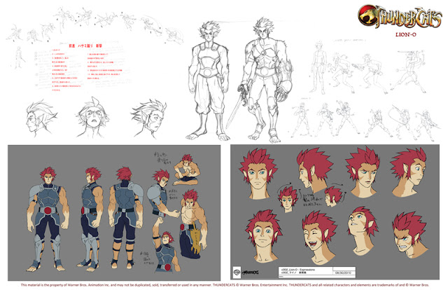
ThunderCats Relaunched!

-By Dan dos Santos


I have mentioned before my love for 80's cartoons here on Muddy Colors, and if any of you attended the IMC this year, you certainly heard me tout it again. So needless to say, I am pretty excited about Cartoon Network relaunching ThunderCats this Friday, July 29th.


I have seen so many movies and comics of late re-vamping old classics (even re-vamps of the re-vamps!), and rarely do they live up to the originals. So part of me was really reluctant to see what they were going to do with ThunderCats. But I must say, I am quite pleased!


The ThunderCats has a really wonderful cast of characters, and such a solid backstory, that there is a TON of potential for a wide variety of interpretations, be it child-like or very adult. You can see some wonderful, un-official renditions of these characters in the recent CGHub challenge.


Ultimately, I think Cartoon Network took a really smart approach. Rather than change the characters dramatically to fit current tastes, they simply changed the animation style. The characters themselves have been altered very little. Even some of the outfits are nearly identical to the 80's version. Yes, the abbreviated style typical of Japanese animation may be to everyone's liking, but it lends itself well to the constraints of animation, and is undeniably popular at the moment, hopefully ensuring the show's success. That is, after all, the real goal... not just appeasing OLD fans, but rather creating a whole generation of NEW fans.


Below are some samples of the pre-production concept art. I particularly love the treatment of WilyKit and WilyKat.


And for a real treat, check out some recently revealed concept art from the original series! It's almost unrecognizable, as it appears the series was initially headed in a totally different direction.
Sunday, July 24, 2011

Robert Hughes - Slow Art

Sometimes it's just about "Slow Art".
RC

Design Assistant job available

Tor Books has posted an available job for the position of Production/Design Assistant. The chosen applicant would be working directly under the award-winning Art Director, Irene Gallo.


This is a great opportunity for those who love SFF art, but desire a more stable career than what freelancing can offer. For what it's worth, Irene Gallo herself started at Tor in a very similar fashion.


More info HERE.
Friday, July 22, 2011

Almost Done

by Eric Fortune


I have two pieces in the upcoming group show at Jonathan LeVine Gallery next month.  And surprise surprise I'm still scrambling to wrap up my second piece.  I've been making good progress and for the last week or so I've been telling myself "ok, should be able to wrap this up in the next day or two".  But this time, seriously, I think in the next day or two I should have this done.


Below are some details of where I'm at with the piece.  I need to add a little more value and depth to the drapery around the figure.  The shaping of the drapery from the neck up was vaguely meandering a bit and didn't quite flow right.  So I've been deciding where the fabric should fold, flap, open up, or fade into the background etc.  Can be a little tricky when painting transparently.  I think it's pretty much nailed down at this point.  I've been making a lot of lateral changes.  That is to say, depending on who you ask it may be better or not or just different.  Of course I feel the changes are worthy but sometimes I wonder if it's worth the time being so nit picky.  Drifting from my reference too much can be a challenge to maintain a sense of realism and cohesiveness.  However, it's probably some of the more enjoyable(What!?  Painting isn't always enjoyable???) parts of painting as well.  Not knowing exactly what's going to happen and then finding your way...most of the time.


I also plan on adding some gray aqua greenish algae on the branches which should make for nice accents of color.  That application will have to be a little more opaque.  Perhaps I could soften the edges of some of the outermost branches to provide more of a focal point in the center, darken the edge of the fabric where it meets the background, detail the hands, a subtle shift in color as the figure moves from shadow to light, add a little more cow bell...  Yeah, definitely one or two more days.


RC

R.I.P. Lucien Freud, 1923-2011

It seems there are just way too many deaths in the art community this year.


I am sorry to report that Wednesday night saw the passing of Lucien Freud. After a brief illness, he died in his home at the age of 88. Dubbed "The greatest living realist" by one art critic in the 1980's, Lucien's work was the subject of a large retrospective at the Metropolitan Museum of Art in 1993.


Read more about it here:

http://www.nytimes.com/2011/07/22/arts/lucian-freud-adept-portraiture-artist-dies-at-88.html?_r=1


Thursday, July 21, 2011

Blood Divided

-By Dan dos Santos


Here's a new cover that just went went public yesterday. The image is for the book 'Blood Divided', by K.J. Breaux, and is the sequel to the book 'Soul Born', for which I also did the cover.


For those of you keeping track, this is 'Red Painting #2' that I mentioned earlier this month. Not being completely satisfied with the previous painting, I decided to take some of what I learned, and try it again. Red is a surprisingly difficult color to work with. The problem lies in that the brightest of reds is relatively low in value. If you lighten it, it either shifts orange or pink, and either one in undesirable. The result is, you really have to dull out and darken everything else in order to get the illusion of vibrancy.


Testing the exposure prior to shooting.
For me, the best part about this job was the model shoot. I decided to hire a new model that I found via Model Mayhem. This is always a real gamble for me, because you don't know if they'll be any good. By the time you find out, it's too late. Money and time have both been wasted. In this case, I really lucked out. The model was not only beautiful, but turned out to be sensationally good. Great poses, expressions, hands, everything.


I also did something I hadn't done in a long time... really spend some time on the costume. I don't think there is any element of the costume that I couldn't simply make up if I had to, and usually that's just what I do. However, actually crafting something for the model to wear is not only really fun, but also helps you put more care into it's design. You are also much more likely to come up with new solutions that you might not come up with if you were just drawing the design on paper. But perhaps the most important part of having a good costume is that it helps the model feel more in the role. Spending an hour transforming your model into something else has a psychological impact on their performance. If they feel like someone else, it's easier to act like someone else. The result was a sensational photo shoot. Honestly, I had the perfect shot with the first 20 frames. Lighting, pose, costume... it was all there. All that I needed to do was paint it as is!


In addition to spending some time on the costume, I also spent a little extra time making a model bird. If I know I am going to be painting the same animal several times in a single piece (like a pack of wolves, or flock of birds), it almost always warrants making a maquette. In this case, I just bunched up aluminum foil around a wire armature. I spray painted it black, and viola! The wire armature actually enabled me to bend the wings into new positions, allowing me to experiment with the silhouette of the bird quite easily. It may seem like a lot of work, but in actuality, I only spent about 20 minutes making the thing. I would have spent ten times that amount sorting through Google images trying to find the right poses otherwise.


My assistant helps pose the bird for additional shots after the model leaves.
I painted the image traditionally, using oils on illustration board, at 20 x 30 inches. I scanned it myself, and sent the file off to the client. They approved it without revision, and just sent me the final type treatment a few days ago.


Wednesday, July 20, 2011

'Savage Beauty' update

-By Dan dos Santos


So I just got back from the Alexander McQueen Retrospective at the Metropolitan Museum, and I must say, it was incredible. Quite possible the most amazing exhibition I've ever seen at the Met... period.


I was expecting to see a lot of great work. What I wasn't expecting, was to walk into a custom crafted exhibition hall full of mirrors, projections, sound effects, wind machines, holograms, and rotating mannequins! Seriously, I can only assume the sets alone costed millions of dollars and took months to assemble.


Further more, almost every piece on display had a custom mask made for it, which was not part of the original ensemble, but really heightened the emotional impact of each piece. Yes, I used the word emotional. It's not too often that a piece of art really stirs me, but this show certainly did just that. It was imaginative, scary, sad, and just all around heart-breakingly good. I left the show doubting my career path.


I really wanted to take photos of the rooms for you guys, but they had a very strict 'no camera' policy. And though they have some pictures on the Met's site, I promise you, they do not do the show justice.


The show comes down in just 16 days! Once the exhibition is over, it is over. It will NOT be traveling.

If you are in the NYC area, you need to see it... If you are not in the NYC, you need to see it.