Tuesday, September 6, 2011

Reference Hunting: The Narrows

By Justin Gerard


In 2004 some friends and I hiked the Narrows at Zion National Park in Utah.  Of all the hikes I have ever been on, this was perhaps the greatest.


During much of the hike, the 100 foot vertical sandstone walls of the canyon close in so tightly that you must hike in the water itself, which is murky, and full of bowling balls, making each step a perilous lesson in jujitsu.


When I was working on the St. George illustrations, I kept coming back to this place in my mind, and in the end, I used it very closely for the images of the last showdown with the dragon.  Part of this, is that amidst all the natural splendor of the Narrows, there is an element of danger, depending on which time of the year you are hiking.


When we got into the park we were told that it would be very dangerous to hike the canyon because if it rained then, there would be a good chance that it would flash flood in the canyon. This would result in either severe injury or death or both.  But only if it rained. And it was suppose to rain.


Also, there were cougars.


After looking at the forecast, my friends were justifiably alarmed that we might get rained on half way out in the gorge and then be overtaken by a chocolate mud-slide of bowling balls and angry cougars. I was only able to convince everyone to go by showing them pamphlets for the hike, which offered glowing, happy pictures of elderly couples and very young children hiking in the stream, unmolested by mud-slides or cougars. If they can brave it, being elderly and infirm, surely we can.


(Confession: The pamphlets were actually not for the hike we would be taking, but a separate, safer one with guided trails. I lied and I am sorry.)


But in the end it never rained, and we weren't caught up in a flash flood or eaten by the indigenous fauna.  Instead we witnessed one of the most amazing places I have ever seen on planet Earth and the most memorable hike I have ever been on.


If you ever get the chance, go to Utah, stop by Zion National Park and hike the Narrows.  You will not regret it.


(But check the forecast first…)


                                                                          Image: Jon Sullivan
Sunday, September 4, 2011

Artistic Insults From Famous Artists

After Dan and Eric’s previous “Crit Submit” posts, I thought it was appropriate to display the crits of famous artist’s disrespecting each other. A fellow illustrator sent this to me a few days ago.....


1. Andy Warhol on Jasper Johns: “Oh, I think he’s great. He makes such great lunches.”


2. Salvador Dalí on Piet Mondrian: “Completely idiotic critics have for several years used the name of Piet Mondrian as though he represented the sum mum of all spiritual activity. They quote him in every connection. Piet for architecture, Piet for poetry, Piet for mysticism, Piet for philosophy, Piet’s whites, Piet’s yellows, Piet, Piet, Piet… Well, I Salvador, will tell you this, that Piet with one ‘i’ less would have been nothing but pet, which is the French word for fart.”


3. Marc Chagall on Pablo Picasso: “What a genius, that Picasso… It’s a pity he doesn’t paint.”


4. William Powhida on Takashi Murakami: “…that hack Murakami trying to consume the market whole and ended up designing handbags…”


5. Pierre-Auguste Renoir on Leonardo da Vinci: “He bores me. He ought to have stuck to his flying machines.”


6. Linder Sterling on Damien Hirst: “Dead butterflies, cows, horses, humans, sheep, and sharks — it reads like the inventory of a funerary Noah. How many halved calves suspended in formaldehyde does the world need? To my way of thinking, none.”


7. Edgar Degas on Georges-Pierre Seurat: “I wouldn’t have noticed it except that it was so big.”


8. Joseph Beuys on Marcel Duchamp: “The silence of Marcel Duchamp is overrated. It has become the territory of a few intellectuals, far from the life of people.”


9. Mihail Chemiakin on Voina: “Many of us can draw a phallus with our eyes closed, but to create something serious? That’s hard, that needs to be studied. Anyone can be an amateur shit-doodling hooligan. It’s unpleasant and casts a shadow on all serious artists.”


10. Frida Kahlo on the European Surrealists: “They are so damn ‘intellectual’ and rotten that I can’t stand them anymore… I’d rather sit on the floor in the market of Toluca and sell tortillas, than have anything to do with those ‘artistic’ bitches of Paris.”


11. Francis Bacon on Jackson Pollock: “Jackson Pollock’s paintings might be very pretty but they’re just decoration. I always think they look like old lace.”


12. Willem de Kooning to Andy Warhol (at a party): “You’re a killer of art, you’re a killer of beauty, you’re even a killer of laughter. I can’t bear your work!”


13. Alberto Giacometti on Pablo Picasso: “Picasso is altogether bad, completely beside the point from the beginning except for Cubist period and even that half misunderstood…. Ugly. Old-fashioned vulgar without sensitivity, horrible in color or non-color. Very bad painter once and for all.”


14.William Blake on Peter Paul Rubens: “To my eye Ruben’s coloring is most contemptible. His shadows are of a filthy brown somewhat the color of excrement.”


15. Francis Bacon on Henri Matisse: “I’ve never liked his things very much, except the very, very early things… I loathe them. I can never see what there is to it, with all those squalid little forms. I can’t bear the drawings either — I absolutely hate his line. I find his line sickly.”


16. Banksy when meeting Robbo: “Never heard of you.”


17. Michelangelo on Raphael: “Everything he knew, he learned from me.”


18. Salvador Dalí on Pablo Picasso: “He finished modern art at one blow by outuglying, alone, in a single day, the ugly that all others combined turned out in several years.”


19. J. Alden Weir on the French Impressionists: “I never in my life saw more horrible things. They do not observe drawing nor form but give you an impression of what they call nature. It was worse than the Chamber of Horrors.”


20. Claude Monet on the French Realists: “Poor blind idiots! They want to see everything clearly, even through fog!”


21. John Lurie on Julian Schnabel in the painting Hittites Attacking The Schnabel: “Oh Lord of Gods we must smite the terrible Schnabel.” “Yes, smite the Schnabel.”


22. Warhol on Julian Schnabel (in his diary): “Julian Schnabel called and said he was coming by with that rock person, Captain Beefheart. And we didn’t want him to, and then I got worried that Julian might have heard what I’d been saying about him — that he goes around to other artists’ studios to find things to copy.”


23. Salvador Dalí on Paul Cézanne: “I began a happening in New York by announcing in front of three thousand spectators that Cézanne was a catastrophe of awkwardness — a painter of decrepit structures of the past. I was applauded, principally because nobody knew who Cézanne was.”


24. Nicolas Poussin on Caravaggio: “Carvaggio’s art is painting for lackeys. This man has come into the world to destroy painting.”


25. Titian on Tintoretto: “He will never be anything but a dauber.”


26. Salvador Dalí on Jackson Pollock’s style: “…The indigestion that goes with fish soup…” 


27.Gustave Courbet on Edouard Manet’s Olympia: “It’s flat, it is isn’t modeled. It’s like the Queen of Hearts after a bath.”


28. Frederic Leighton on James McNeil Whistler: “My dear Whistler, you leave your pictures in such a sketchy, unfinished state. Why don’t you ever finish them?”


29. James McNeil Whistler on Frederic Leighton: “My dear Leighton, why do you ever begin yours?” 


30. Anonymous vandal on Shepard Fairey:

RC
Thursday, September 1, 2011

Crit Submit #3... Part 1

by Eric Fortune


For today's post I have chosen one of the images submitted for critique. I'll try my best to give some constructive feedback.


What first struck me about the submission is that it seemed a bit lacking in general. I felt it needed more atmosphere, more character, more props, and perhaps a little more focus.


The first thing I did was add a little fog. Not necessary, but it seemed appropriate and added a bit of mood. The fog also toned down some of the middle and foreground. It gave the piece a little extra atmospheric perspective which will also assist in focusing on our main characters.


Next I added a little life to the piece with some street lamps and perhaps a few people burning some midnight oil. Staggering the lamps back the middle of the piece also adds to the depth.


This piece has a lot of pattern in it with all the windows portrayed. However, there's also great opportunity for some brick patterns here as well that hasn't been taken advantage of. Pattern on pattern on pattern can become overwhelming. But it can also be subtle and nuanced. In this particular instance I think a little brick pattern can help bring a variety or texture into the piece.


Because of the spotty pattern our main characters don't seem to be getting the attention they deserve. I darkened the protagonist(I'm assuming he was minding his own business when this lady in white forced him to defend himself yes? .....I jest;) I darkened the stalker to give him more weight and to help separate him from the background. For the female I gave her a make over by adding some fleshy tones to her fleshy areas. I also darkened the background behind her to help her to stand out a bit more as well. It's perhaps too subtle but I used some reddish hues around the female as well. Adding a little more of a dark color instead of just using black out of the tube is a good way to introduce more color and to enrich your piece. Lastly, I also added a little blue into the sky.


Some other things to consider. This is a looser piece and all the different variations and style of line work etc. gives it character. However, you'll want to mind your perspective on some of the windows. Some are heading off to a vanishing point in the sky instead of towards the horizon line. Secondly, the bridge doesn't seem to be connecting to anything on the left side. It appears to be a dead end. Make sure the piece structurally makes sense. Lastly, you may want to do the piece a little larger so that you can give a little extra care and attention to your main characters. And as always, make sure you have appropriate reference where needed whether it's figurative or environmental.


Hope this helps.


RC

Crit Submit #3... Part 2

-By Dan dos Santos


Thanks again for all the wonderful submissions, guys! I swear some of you are just trying to show off. Quite a few of the pieces were really spectacular, and definitely not in need of any real critique. Perhaps we'll share those here someday.


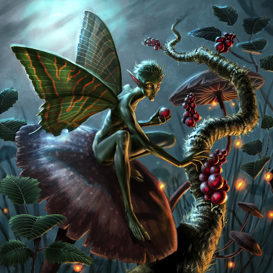
I've chosen a piece by Ryan Valle, that I personally thought was quite close to being successful, but just suffered from a few minor faults.


The first thing that struck me about this piece was it's inefficient use of black. Like white, black is a really potent color and needs to be used sparingly, usually reserved for the subject and foreground elements. In most lighting situations, even at night outdoors, the distance fades to grey... not black. The exception to this rule are things like caves where there is no ambient light at all. Here, I felt the black background did more harm than good.


The first step was to lighten the background. I just drew a lasso around all the black, lightened it up using 'levels', and added a little bit of lens flare to see if I liked it. Any variation in the sky's color was already there... it was just too dark to see.


I did like the way the lens flare helped to pop the figure, so I pushed it further and painted it into a moon. I also amplified the backlighting on the subject to help reflect this change.


The subject never felt particularly 'grounded' to me, mostly due to a lack of believable shadow. In the pic above, I simply added a more obvious cast shadow from the figure onto the mushroom. I also added the indication of a few more background elements (hidden amongst the grass) to help push the sense of depth.


The fill light on the front of the figure was a bit unjustified... and actually a tease. We know something must be illuminating him, but what? A lantern, a bug, a village? Narratively speaking, the piece is better off showing the source of that light. In this case, I felt lightning bugs would do the trick.


The artist chose to give the fairy blue eyes in the original piece, shown above.


I felt the subject would be better served with orange eyes, to help make him stand out more.


Liking the way the orange of the eyes popped against the blue, I decided to push those orange accents even further, and added some additional decoration to his wings. I also added a bit of glow inside the berries to make them look a bit more magical. Again, this was a narrative consideration. Maybe the berries aren't food, perhaps they are medicine, or eggs?


I adjusted the color balance here just to accentuate the blue/orange theme.


Lastly, I added a bit of orange glow to the bottom of the canvas to imply that more may be going on just beyond our view.... giving us our final picture.


And here is a small GIF to help you see the process:


Photobucket


Thanks again to everyone who participated, we really appreciate your enthusiasm. And a special thanks to Ryan Valle for being brave enough to let us all learn from his work.


Stay tuned, as I may post a few more crits over the weekend that I already started, but just need to polish up!
RC

LoTR Sketches

Donato has been selling limited edition copies of his "Middle Earth: Visions of Modern Myth" book, which each contain an original sketch inside. Here is a quick peek at some of those sketches.


RC

Hand painted


RC

Cinderella 1: Free Disney Princess Coloring Pages


Here's your favorite Disney Princess, Cinderella! Fill with color these Cinderella coloring pages and turn her into a beautiful princess! Grab this Cinderella coloring book for free printables of Cinderella and his Prince Charming. Click here to download the 10-page coloring book: