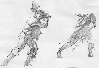
Gregory Manchess
Sometimes, you just have to take the risk, no matter what the client is asking or paying.
Irene Gallo asked me to do the cover for Tor.com’s ebook of Lord of Chaos. A huge battle scene was needed. Gigantic: 400,000 warriors on one field. All of it had to fall within a square format, too.
There was no way. Unless I painted lots of tiny little figures with no scale and no drama, this was sure to fail. So I took a risk. I asked Irene if I could stretch the layout to one side or another so that we could see the entire battle scene. Much like a wrap cover. We agreed I would pick the sweet spot for the cover square, and the rest of the scene we could include in a post for Tor.com where we talked about the painting process for fans of the series.
She was delighted and thought I was taking on too much. I was, but with thirty-three years in the business behind me, and tons of study of action paintings, I decided to go all out. Sometimes, ya just gotta get crazy.
Hold on though. This was no ordinary battle scene. It's broad daylight, lightning cracking out of a clear blue sky, and two hundred thousand semi-ninja warriors getting barbecued by explosive magic. As I broadened my painting horizon, so did the editors involved and requested more characters be included. Even attacking wolves. What the heck, let’s just throw in the Space Shuttle.
There was so much to organize. I started, as always, with thumbnails to try to work out the point of view. The composition would have to develop from there. I wanted the viewer to be right in there with the main action. Priorities: point of view, sweet spot, then composition. But composition can always trump the other two.
I have my own particular methods when it comes to action scenes. I choose the right perspective, then decide on foreground, middle ground, and background design. Like layers of action within the action. Light plays a major role in illuminating the layers and what I want the observer to look at and where. I control how they will absorb the piece. This is critical.
The black-clad guys have so much power, they stand in a broad semi-circle and blast people into piles of meat. I chose the moment before. Can you blame me?
Here's the cover more rendered as I visualized it out of my head, and another sketch for keeping details straight and explaining what I had in mind to Irene.
I also compose smaller areas within the composition. I call it ‘clumping’ as I group figures within a mass of figures. It is not random, it is planned, but it must look as if it’s random in order to achieve a pleasing design within the mayhem. Otherwise, you get mayhem. Snore.
The finished sketch in two sections.
But it wasn't right, so I spent over five hours just rearranging figures in the layout. Plus adding some characters. I drew open-line silhouettes of the main figures on separate tissues and moved them around. I suppose I could've done this on the computer easily.
And a couple of studies. I couldn't find the wolves I needed so I had to freehand them. I shot lots of figure reference: me dressed up and running at my camera. I'd have worked from nature, but I didn't have the room to set fire to fifty guys in my studio.
I also wanted to test some painting skills by making the painting large. That added even more time, but valuable training. It started as a five foot painting, but ended up being over six feet wide. It took the better part of four days to paint, but not full days. I had other work to do, too. I worked on it mostly at night so I could control the lighting under the camera. Part of the slow down was because I recorded the piece in time-lapse, and I had to fuss with the program that drove my SLR.
Once it was finished I showed it to some illustrator friends. Bruce Jensen did a quick render of the piece in a wide angle view, moving from left to right, like a cinematic pan-shot. Irene saw it and thought it a great way to showcase the full image as a flat scan, ending on the sweet spot for the cover image.
There are more details and explanations at Tor.com’s post about Lord of Chaos. You can watch me paint the dang thing, too, in time-lapse. (Watch closely and you’ll see my animation of one of the lightning strikes on the far left.)
I could be mistaken, but technically, it could be the very first animated book cover. Well, it’s at least the first pan & scan cover.
You have read this article with the title Lord of Chaos. You can bookmark this page URL https://teamcolors.blogspot.com/2010/12/lord-of-chaos.html. Thanks!
Write by:
RC - Wednesday, December 15, 2010


Comments "Lord of Chaos"
Post a Comment