 -Jesper Ejsing
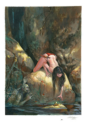
I wanted to do something evil and creepy but with more mood than core, and finally I decided on something that would allow me to still fit in a barbarian babe. I sketched a loose thumb of a nude girl reaching for jewels hanging out on a branch, maybe placed there in the sun as a bait. In the shadows underneath the rocks and half covered in water hid the zombie, that had placed the jewels. The nude would not only be because I could, but because the soft skin would show her as being more vulnerable and less protected.
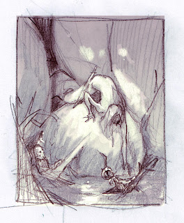
I took it around at the studio and
Next I did the real sketch. I placed things more correctly and tried out 2 different colour themes.


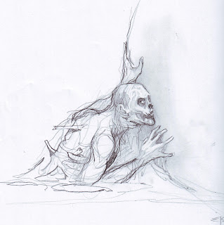
Once again I asked around at the studio and got 50-50 for both versions. Next step was doing some more precise sketches of the 2 figures. The zombie came right out in first try. The eagerness of him was very important. I wanted him to look hopeful, even if it is not a very common thought for zombies, I am guessing.
The female sketch was okay, but I was already anxious to get the face right. I asked on Facebook if anyone in the
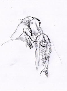
With the 2 figures sketch on separate papers I copy pasted them in to the thumb sketch in Photoshop. I think it is a good think to sketch the different figures separately after the thumb and after you know what and how they are supposed to look and pose. This way you can do sketch after sketch until you get it right, as opposed to doing the whole sketch on one paper. ( yes I did that years ago. Sketches all in one paper in 100% until someone pointed out that it was a waste of time, effort and paper. And I was introduced to Thumb-sketching ). It takes the pressure out if it and lets you aggressively power every single figure for what it is supposed to do. Only when every figure is fully sketched to its potential, I combined them digitally. In this case it is not that difficult, but had this instead been a battle scene of five figures you can see how much benefit it is to separate them. Also It cheats the mind to concentrate on small bites instead of the whole cake.
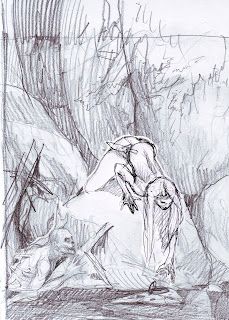
Next step. Ordinary I would transfer the sketch the hard way on to board or paper and thus drawing it a third or forth time. This time I tried a little trick taught to me by the honourable and talented Steve Prescott. My fellow fantasy artist friend and acrylic painter. He prints out the sketch onto
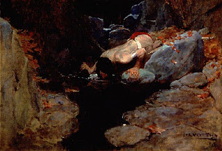
Lastly I found the Wyeth painting that originally inspired me to this painting. I looked hard at it for 2 minutes and then removed it to avoid copying.
The final painting is really nice. And I was proud to deliver it to Dan and Irene.
Lastly, you can buy this painting on ebay today if you place a bid on the auction.
You have read this article with the title The Trap. You can bookmark this page URL https://teamcolors.blogspot.com/2011/05/trap.html. Thanks!
Write by:
RC - Wednesday, May 25, 2011


Comments "The Trap"
Post a Comment