-By Jeff Simpson
This painting should provide a pretty good representation of how my recent personal works are created. I’ve almost gotten it down to a formula now, which worries me a bit since I feel like whenever I have gotten used to a certain way of drawing or a certain technique, I need to find something new to keep it fresh and interesting for myself (Having said that though, I still only ever use the hard round default brush....) I greatly enjoy doing personal work, the ability to express yourself and have fun without having to adhere to a clients tastes is refreshing. As usual I’m using Photoshop CS5 and a medium sized Intuos tablet.
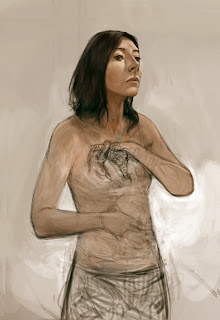 This piece, like most, started out without much of a strong basis or idea. I like to let a piece sort of find its own way into being..whenever I try to stick to something, it becomes more like work. This is a personal painting, I do it to have fun and relax and play. Hopefully that ends up being reflected in the piece somehow. As always, it started out as a portrait. While I am rendering I am always thinking about how I’m going to spice it up or throw in some interesting themes. This is a TERRIBLE idea since I know I will probably end up erasing or changing what I have spent so much time rendering. However this doesn’t really bother me since I simply love to render, and the magic of digital painting means nothing is truly lost forever.
I start out with a quick sketch usually straight into photoshop. To render I usually lay down my darker colors first, then add a mid tone, then lighter tone, then highlights/specular each on their own separate layers so I can easily adjust their opacity or hue if I need to.
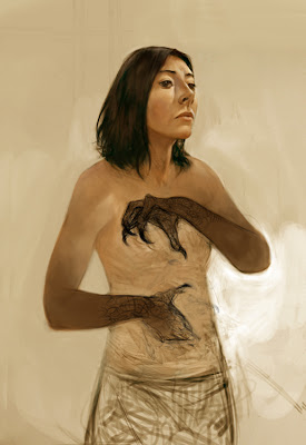
I spend a lot of time playing with colour adjust and gradient maps to get something interesting going on. This also helps unify colours if things are starting to look to muddy. Recently I’ve been incorporating a lot of textures into my work, I am often asked how they are achieved which I thought surprising since the process is very basic. I scan in various traditional mediums (usually swatches of acrylic paint or coloured pencil) and adjust their layer settings (I spend a lot of time cycling though the settings to see what looks best).
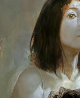
Colour dodge, overlay and screen are the ones I usually end up using, I use a layer mask to paint in the parts I want, which I can always modify with a colour adjust a swell. I am constantly sliding in new textures as I paint too, which helps weave the textures into the image quite nicely.
The blue outline of the figure was actually an old pencil sketch I did from life drawing, hence the pixelation and artifacts which I actually though looked pretty interesting...but ultimately had to town down. During the last third of the process I am rarely actually painting much at all, just adjusting and tweaking the colors and tone. Sometimes I like to add a unsharp mask or high pass in some areas to help bring out the brushstrokes or little details as a finishing touch.
Thank to Jeff for taking time out his schedule to do this wonderful guest-post for us! Be sure to check out more of Jeff's work at his website: http://jeffsimpsonkh.cghub.com/
This painting should provide a pretty good representation of how my recent personal works are created. I’ve almost gotten it down to a formula now, which worries me a bit since I feel like whenever I have gotten used to a certain way of drawing or a certain technique, I need to find something new to keep it fresh and interesting for myself (Having said that though, I still only ever use the hard round default brush....) I greatly enjoy doing personal work, the ability to express yourself and have fun without having to adhere to a clients tastes is refreshing. As usual I’m using Photoshop CS5 and a medium sized Intuos tablet.
 This piece, like most, started out without much of a strong basis or idea. I like to let a piece sort of find its own way into being..whenever I try to stick to something, it becomes more like work. This is a personal painting, I do it to have fun and relax and play. Hopefully that ends up being reflected in the piece somehow. As always, it started out as a portrait. While I am rendering I am always thinking about how I’m going to spice it up or throw in some interesting themes. This is a TERRIBLE idea since I know I will probably end up erasing or changing what I have spent so much time rendering. However this doesn’t really bother me since I simply love to render, and the magic of digital painting means nothing is truly lost forever.
I start out with a quick sketch usually straight into photoshop. To render I usually lay down my darker colors first, then add a mid tone, then lighter tone, then highlights/specular each on their own separate layers so I can easily adjust their opacity or hue if I need to.

I spend a lot of time playing with colour adjust and gradient maps to get something interesting going on. This also helps unify colours if things are starting to look to muddy. Recently I’ve been incorporating a lot of textures into my work, I am often asked how they are achieved which I thought surprising since the process is very basic. I scan in various traditional mediums (usually swatches of acrylic paint or coloured pencil) and adjust their layer settings (I spend a lot of time cycling though the settings to see what looks best).

Colour dodge, overlay and screen are the ones I usually end up using, I use a layer mask to paint in the parts I want, which I can always modify with a colour adjust a swell. I am constantly sliding in new textures as I paint too, which helps weave the textures into the image quite nicely.
The blue outline of the figure was actually an old pencil sketch I did from life drawing, hence the pixelation and artifacts which I actually though looked pretty interesting...but ultimately had to town down. During the last third of the process I am rarely actually painting much at all, just adjusting and tweaking the colors and tone. Sometimes I like to add a unsharp mask or high pass in some areas to help bring out the brushstrokes or little details as a finishing touch.
Thank to Jeff for taking time out his schedule to do this wonderful guest-post for us! Be sure to check out more of Jeff's work at his website: http://jeffsimpsonkh.cghub.com/
You have read this articleDan dos Santos
with the title Spotlight On: JEFF SIMPSON, Part 2. You can bookmark this page URL https://teamcolors.blogspot.com/2011/07/spotlight-on-jeff-simpson-part-2.html. Thanks!
Write by:
RC - Friday, July 15, 2011


Comments "Spotlight On: JEFF SIMPSON, Part 2"
Post a Comment